So I recently visited Multiply, a blogging and social networking platform for the general population. I haven't visited in a while, so I decided to check out the site.
Oh. A new interface. Whoa! That looks very familiar to me. That looks a bit like our design. Hmmm...
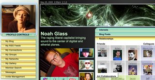
I also received an email from them yesterday announcing their various changes. Anyway, I believe GoingOn's design and toolbar is unique. It's not something that people would derive from visiting all these Web 2.0 services out there. It was a design specific to our network of networks model and an idea that Tony developed for all our users to have floating personal toolbar.
So it's logical for me to assume Multiply got the idea for their new design from our SiliconBeat and Mercury News coverage where our mockup was posted:

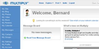
Or from a venture capitalist that knows both parties? Who knows. Well, that mockup has been up since last July and we're still not live yet and they are :) Here is Multiply's new redesign:

No comments:
Post a Comment